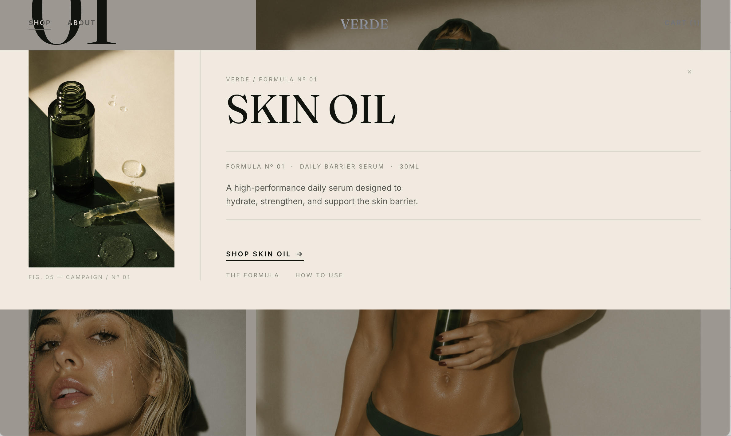
An editorial commerce experience built around a single formula. Slow, considered, and campaign-led from the first scroll.
Most skincare websites try to say everything. Verde says one thing: this formula is worth your attention. The project started as a question: what does a skincare brand look like when it's edited down to only what matters? No grid of products. No cluttered navigation. One product. One story. One clear reason to buy.
The visual language was built to feel like a magazine, not a store. Campaign photography leads. Typography recedes. Negative space does the heavy lifting. The palette of warm whites, deep forest tones and quiet blush was chosen to feel like a morning ritual rather than a product launch. Nothing should feel urgent. Everything should feel intentional.
Two typefaces. A single accent color. Spacing rules strict enough to feel considered but loose enough to breathe. The design system for Verde was built to scale, adaptable to any founder who wants the same editorial restraint for their own brand, without starting from scratch.
The site moves the way the brand feels. Unhurried. Sections reveal on scroll without drama. The path to purchase is short and uncluttered. Hero to product to checkout in three steps, because every extra click is a reason to leave. Verde was designed to convert without ever feeling like it's selling.
Launching a skincare brand with one hero product?
VERDE is available as a semi-custom website experience. Your brand, imagery, product and story. Built and launched by Pink Web Studio.
Inquire about Verde →