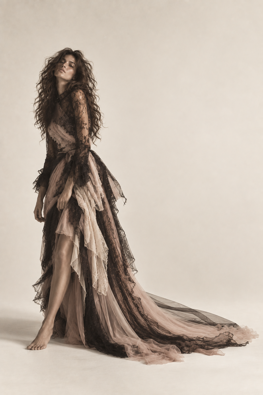
CLEO DAISY began as an exploration of what a fictional independent fashion label could feel like online. Rather than building a traditional ecommerce experience, I approached the site like a digital fashion editorial: oversized typography, unconventional composition and imagery that becomes part of the interface.
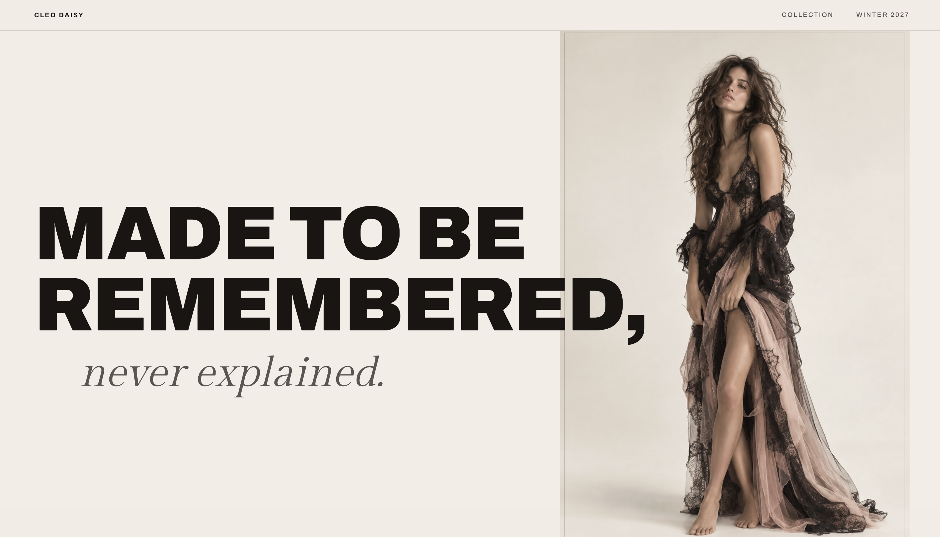
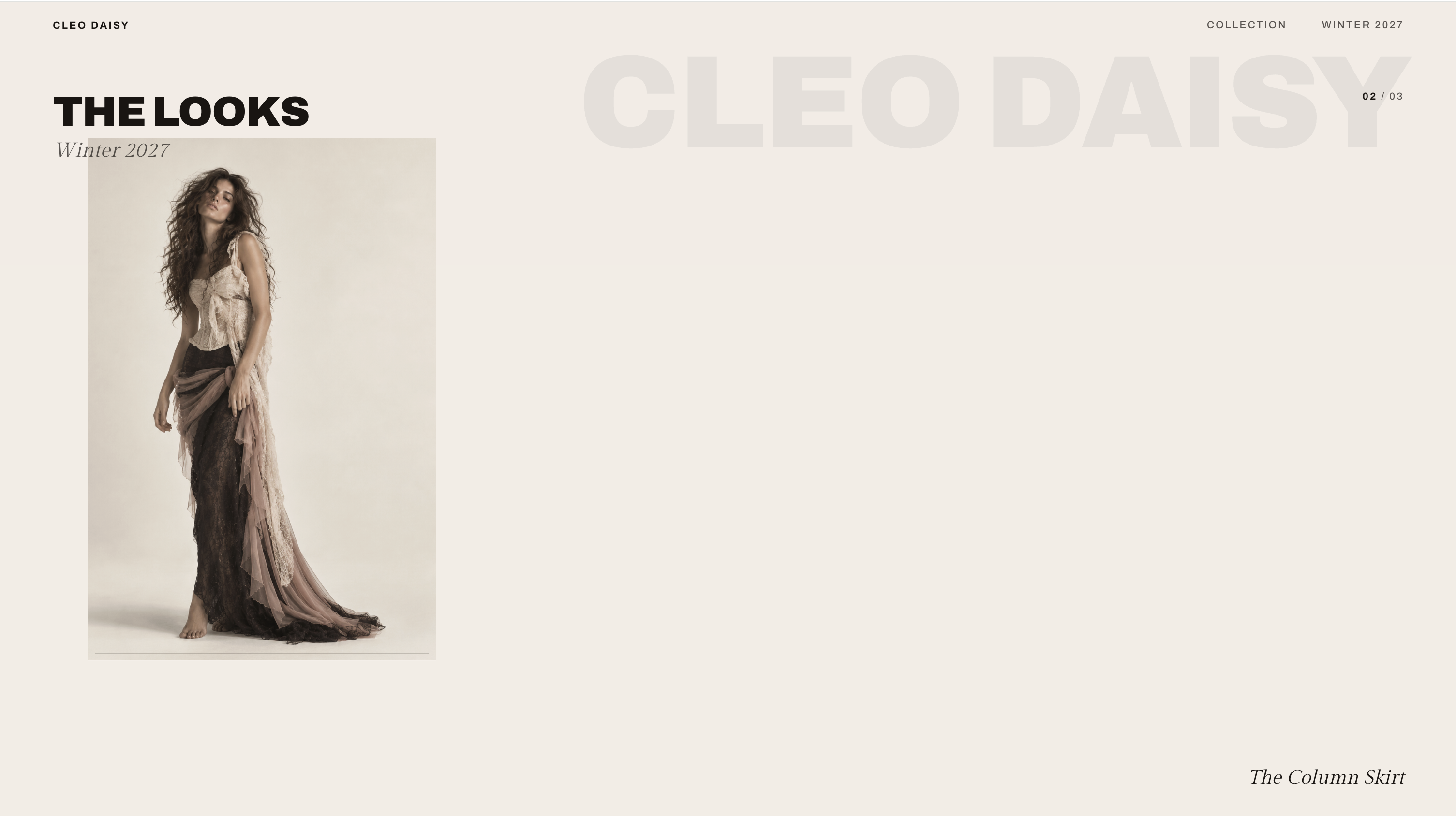
CLEO DAISY was art-directed around restraint and contrast: warm ivory space against black, dusty rose, and delicate lace textures. I used oversized typography, asymmetrical layouts, and intentional negative space to make the site feel closer to an independent fashion editorial than a traditional brand website. The goal was for every screen to feel composed, but never overly polished or predictable.
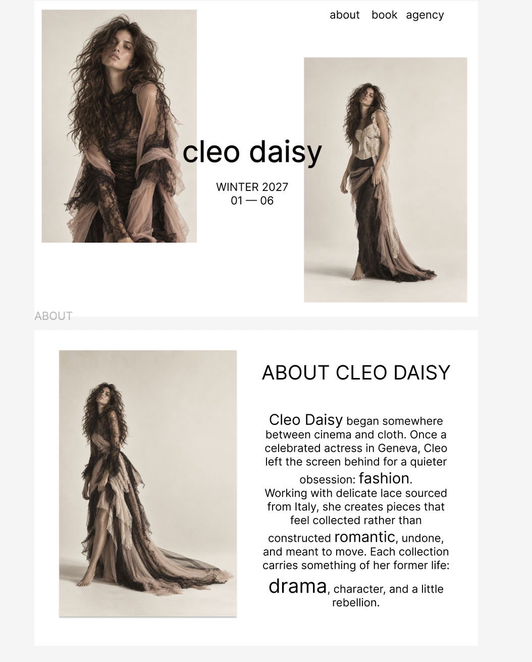
I started in Figma to establish the visual language, composition, typography, and overall rhythm of the experience before moving into development. The final build translates those layouts into a responsive experience — adding movement and interaction that couldn’t exist in the static designs. Transitions are slow enough to feel intentional: scroll pacing, image reveals, and hover states all follow the same unhurried logic as the editorial itself.
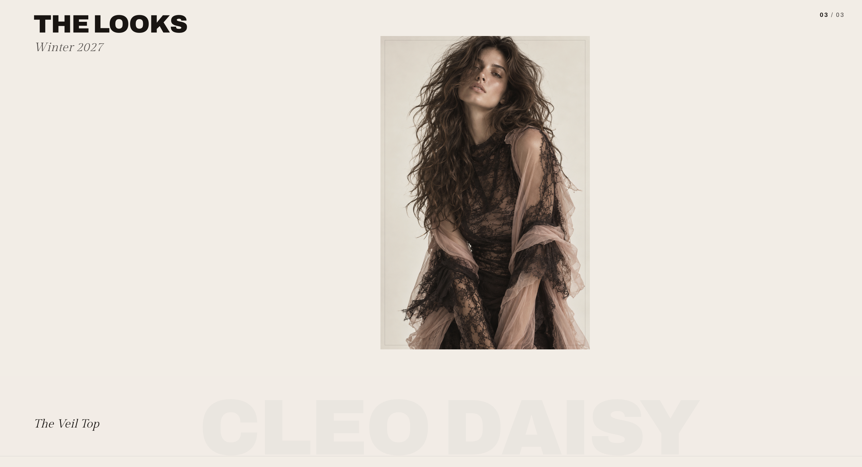
Design, development, and a little obsession with the details.
Start a Project → Explore our Signature Website service →